Follow simple eCommerce homepage best practices for higher conversion to improve your store’s “visit to open product page” conversion number.
Very often, we see website home pages filled with confusing calls-to-action (CTAs) that never get clicked.
It’s important to remember that a home page has only two objectives:
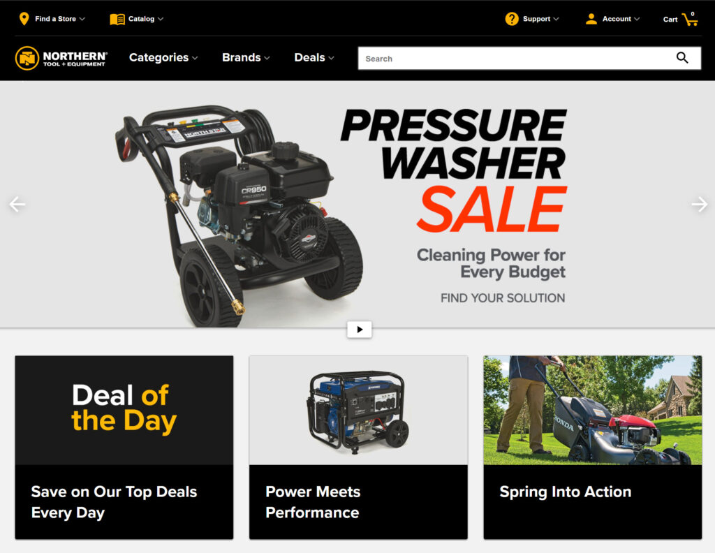
- For most websites, it is the primary landing page. As a result, it’s critical that it clearly communicates the value proposition.
In a few seconds, visitors should understand what they can do here and why they should do it – why they should stay on your website rather than go to your competitor’s.
“What’s in it for me?” is the question you must answer. You’ll have to put some effort into testing your value proposition.
- The home page has to lead customers away from the home page and closer to completing a transaction. You want your visitors to be able to quickly go to a category page or register for an account (if your goal is to grow your B2B customers). Many large e-commerce websites make this mistake and don’t feature a broad enough range of product types on the homepage. Due to the small selection of product kinds provided on the homepage, customers misinterpret the type of site or underestimate its product range. Such misunderstandings can be extremely destructive to a website, as customers are unlikely to search for a product they don’t believe the site would carry. The best way to accomplish that is to show all your top-level product categories as icons in 3 or 4 rows.
After your home page has accomplished these two objectives, you apply the general principles listed below for calls to action and usability to make your home page convert better than many multi-million dollar brands that make all those mistakes on their homepages.
E-commerce Homepage Best Practices:
1. Avoid placing intrusive, forceful adverts on the homepage. Very flashy advertisements placed within the main content frequently cause visitors to respond negatively.
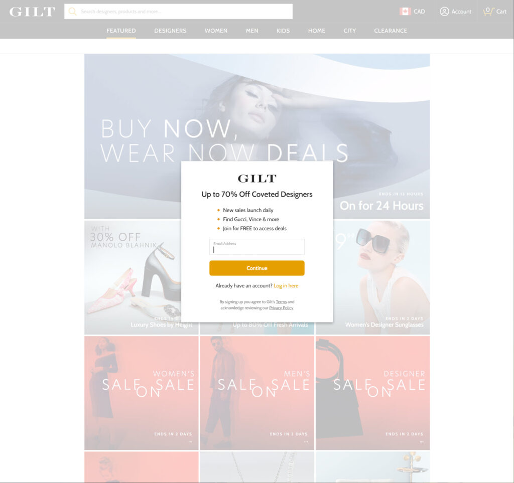
2. Some people regard pop-up banners and overlay dialogues on the site (such as newsletter signups) as “spam” and even hate them.
3. If appropriately used, slideshows and sliders can highlight features, bargains, and wizards. Slideshows can autorotate, but not too quickly, and autorotation should stop while the mouse hovers. Static content sections and blocks perform just as well or better on most e-commerce sites and are easier to build and manage than carousels.
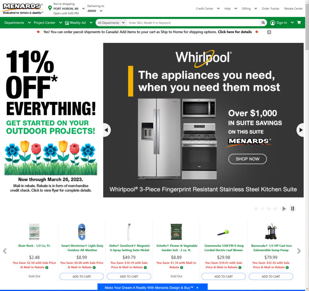
4. Video banners and backdrops are too distracting and should not be used because they distract from the main value proposition on the home page.
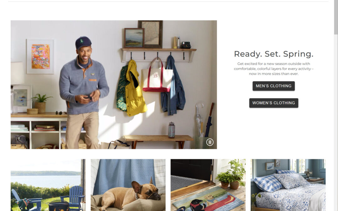
5. A home page with custom images of happy customers using the company’s products will make visitors more loyal. Pages using stock imagery or uninspiring cutout pictures will underperform.
6. Header and navigation arrangement must be evident to users. Search, login, cart symbol, and other components must be in the “expected” location for a convenient e-commerce experience.
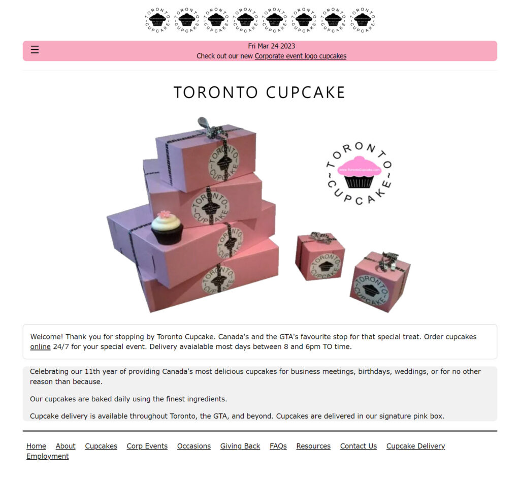
7. The search field must be clearly visible and cannot be covered by a magnifying glass icon.
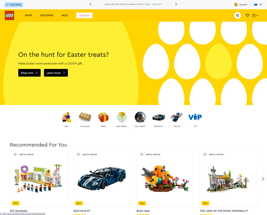
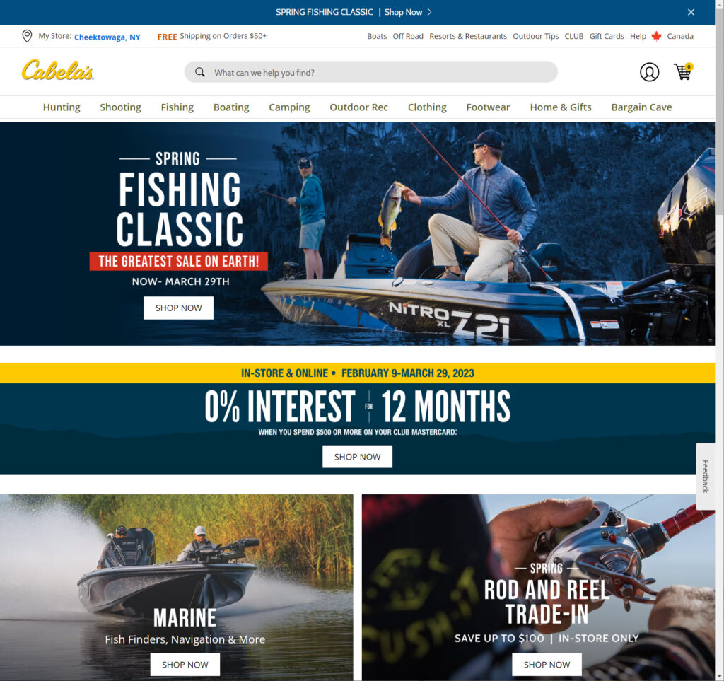
8. Calls to action (CTAs) must be appropriate for the buyer’s stage. The call to action on your home page has to be “See details” or “View more” because visitors won’t “Buy Now” from this page.
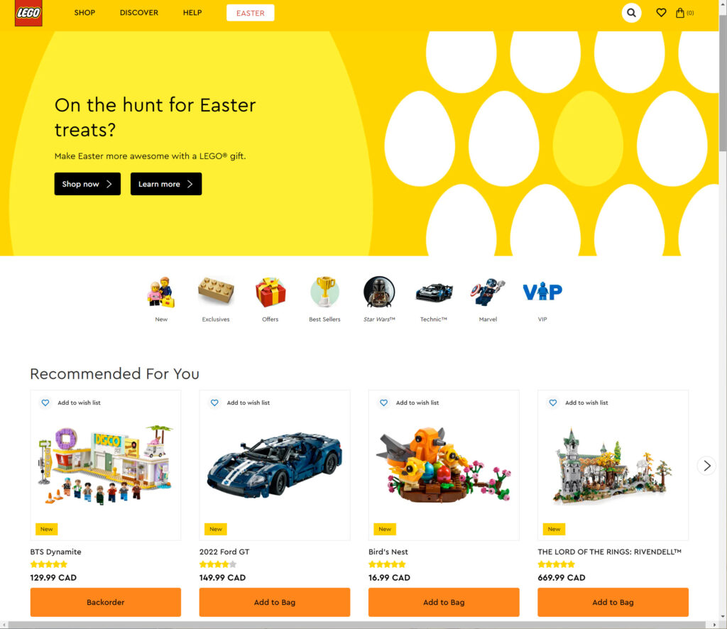
9. Design clickable interface components to make what can be clicked or tapped apparent without enclosing several CTAs or links using a banner or colored section with a single CTA per section. Using hover effects and styling, visual elements can be linked to one or more destinations.
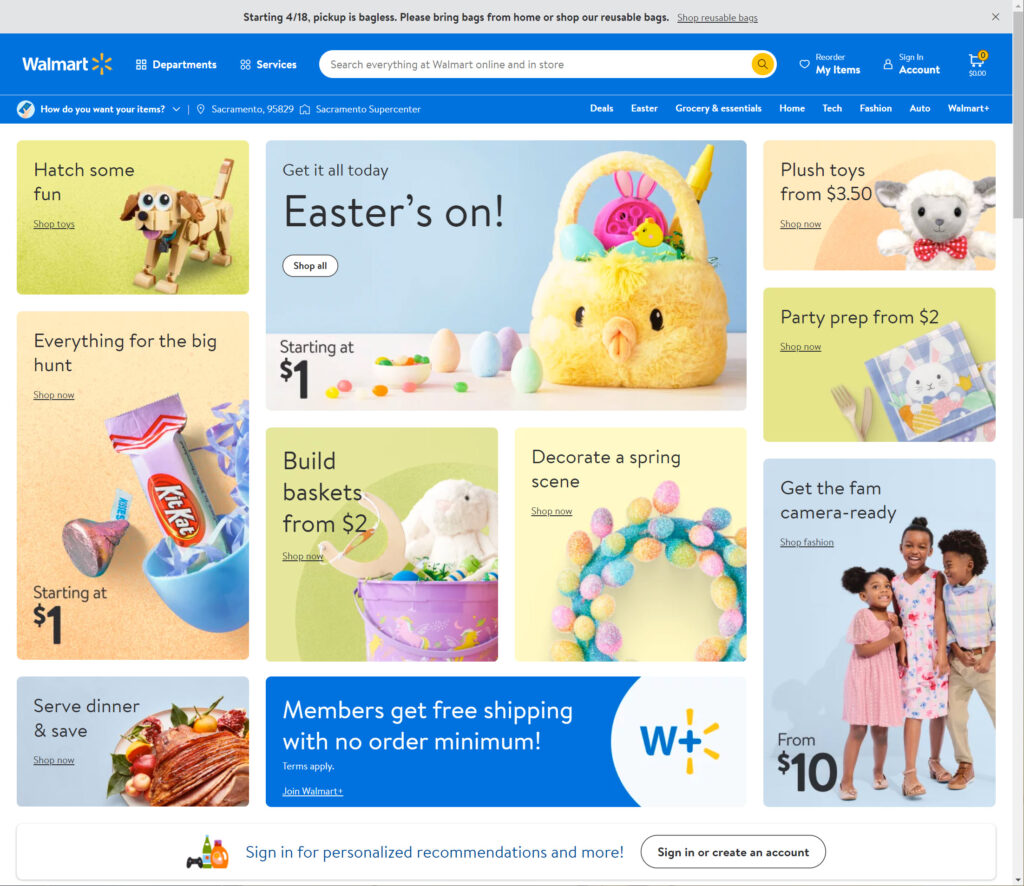
10. Verify the text for spelling and grammar mistakes. Nothing decreases website conversion as much as apparent mistakes.
11. Clearly display specific product categories, such as “Sales” or “New Items.”
